Indic Typesetting Collaboration Document
This document is a place for collaborating on all matters relating to Scripture typesetting in South Asia, including pre-publication clean-up, with special attention to handling the issues of Indic writing systems. Please feel free to add or update content. We are using a Google Doc so that users can discuss specific items by inserting comments.
If you add new topics, please refresh the Table of Contents. Any files to be shared, such as stylesheets, can be uploaded to the Indic Typesetting Google Drive Folder, making use of the Description property to provide all the relevant details.
A useful Glossary of printing and typesetting terminolgy can be found here.
Known Issues yet To Be Addressed
This document needs to be updated in the following ways:
-
(Add to the checks to be performed) If \rq is used, ensure that these are always at the end of a paragraph
-
Update Transfer Parallel Passages tool to refer to book names in Reference settings
-
Fix the Glossary filter to handle “Heaven’s man” or ‘Heaven\’s man’ -
Make a list of Best Practices for each script (fonts, stylesheets, etc.)
-
Thumb Tabs: Files are in Indic Typesetting > Thumb Tabs.
-
Subscribe to the Global Typesetting CoP ([email protected])
-
Authorized versions available for typesetting (for Diglot purposes): NET as Doc, WEB, KJV, ULT (formally ULB),
NIV, TEL29OV -
Tool for splitting/merging/manipulating PDF documents: PDFtk
-
Refer users to Help File for steps for creating TOC.
-
Refer users to Help File for instructions on running header codes for diglots.
Other TO DO:
-
Dan: Make announcement on the new resources available.
SECTION 1: PRE-PUBLICATION CLEANUP
Recommended Usage of Dashes
-
A hyphen (-) joins words together (e.g. "well-rounded"), or specifies a range of verses in the same chapter (e.g. "3:4-5"). It is only valid word-medially.
-
An en dash (–) specifies a range that spans a chapter boundary (e.g. "3:28–4:2")
-
An em dash (—) is used to separate a sentence clause. When used on its own, it is like a colon (:). (e.g. "Abel also brought a gift—the best of the firstborn lambs from his flock.") This can be a good choice in languages that use a visarga character (कः) word-finally, that a colon could get mistaken for. When used as a pair, it is similar to parentheses or commas, but gives more emphasis to the enclosed clause. (e.g. "Bring a pair of every kind of animal—a male and a female—into the boat with you.")
-
None of these dashes should ever be separated from the adjacent text by a space.
Checklist of Useful Checks
Here are some things that are often overlooked in pre-publication clean-up:
-
On Indic projects, run “Analyze Zero-Width characters”. This will almost always reveal a significant number of issues.
-
Punctuation Inventory
-
Translators often mark everything as valid.
-
Sort by count. Especially scrutinize rare characters.
-
Common errors:
-
Em dash (to separate text) vs. en-dash (to separate references that span chapters) vs. hyphen (to join words)
-
Plain quotes should almost always be invalid. (Exception: Plain single quote used as a tone marker.)
-
-
Check for the existence of soft hyphens (00AD). Generally these don’t belong in the text.
-
-
Character Inventory:
-
Uncheck combinations. Sort by count. Especially scrutinize rare characters.
-
Check for inconsistent use of script vs Western digits. (Use ReplaceDigits tool to correct.)
-
-
Also use Number check to ensure consistency of number format.
-
Use matched pairs check.
-
Use Schema check. (Hold down Shift when clicking Run Basic Checks.) Must be able to pass this check in order to upload text to the DBL.
-
Extract all footnotes. In Paratext, find
regexCopy to clipboard\\f .*?\\f\*or in RegExPal > User > Extract all footnotes.
-
Watch out for cross references incorrectly in footnotes. Search for
regexCopy to clipboard\\ft [^\\]*\d:\d-
If footnote contains only references, convert to \x + \xo … \xt …\x* format.
-
If footnote contains text plus references, wrap references with \xt …\xt*
-
-
-
Extract all cross references. Find
regexCopy to clipboard\\x .*?\\x\*
or in RegExPal > User > Extract all cross-references.-
Check for even distribution. (Not missing in some books.)
-
Check for consistent use of \x + (plus, not minus)
-
-
Extract all parallel passage refs (\r). Find regex:\\r
\* or in RegExPal > User > Extract all parallel passages references.
Check for even distribution.
-
Extract all \io markers. In RegExPal > User > Extract outlines.
-
Ensure \ior is used. (RegExPal rule can insert all automatically if missing: Insert ior around intro references.
-
Ensure even distribution. (Not using \ip instead in some books.)
-
-
Extract all figures.
-
Ensure consistency in reference format with/without parentheses.
-
Not too close together.
-
No repeated images. (If many, extract all image filenames to spreadsheet. Highlight duplicates.)
-
Ensure permissions have been obtained as needed, particularly for Cook images. (CN* and CO* images.)
-
Notice if any CO pictures are in NT, or CN in OT, as they may be unsuitable.
-
Ensure usage tagging is correct for print vs app vs web.
-
-
Paragraphing
-
Extract all \q* and \li markers to observe pattern of use. Not a series of 3 or more \q1 in a row. Alternate with \q2.
-
Discourage use of \q4.
-
\li is good for lists, such as genealogies. See NIV usage.
-
Check usage of \m to continue paragraph after a \q quote.
-
-
Sentence-final punctuation
-
Relatively long/short verses, sentences, etc.
-
Has team made use of Biblical Terms tool? Parallel Passages tool? Spelling check?
-
Is FRT complete? E.g. Translation for “Table of Contents”
-
Encourage team to consider adding “Themes” to their FRT book. (e.g. see ideas here)
-
-
Glossary
-
Discuss marking of glossary terms, especially in light of app usage.
-
If not full NT, discuss typesetting a filtered glossary containing terms used only in these books.
-
-
Maps
-
Check that labels are reasonably sized and well-positioned.
-
Check positioning of label arrows. E.g. Patmos.
-
Check that either curved rule text is appropriate, or curving is turned off.
-
On map of Paul’s three journeys, turn arrows off if not printing in color. Ensure title is still appropriate. (e.g. “Places Paul traveled” rather than “Paul’s three journeys”)
-
-
Scripture reference checks
-
Besides the obvious parts of these checks (e.g. that these settings match \toc), also ensure that \toc1 and \mt match, and \toc2 and \h, as the built-in checks do not verify this.
-
Paratext RegexPal Tips & Tricks
RegExPal Overview
Regular expressions ("regex") provide an extremely powerful means of finding and/or replacing text according to flexible patterns. RegExPal is a tool that enables you to apply regex searches/replacements on Paratext project data.
Read the included help file for help on getting started.
Matching Word Boundaries in Non-Roman Text:
RegExPal inherits IronPython’s not-so-ideal handling of Unicode. In particular, don’t rely on \b (or \w or \W) to work properly on non-Roman data. IronPython supports only “simple word boundaries”, not the “default word boundaries” described in UTS #18 (Unicode Standards for RegEx Engines). Thus, if you wanted the regex to match only the whole word कि without matching the word किन or नकि, it won’t work to search for \bकि\b. However, because we can assume that virtually all data in Paratext has some adjacent character before and after (even at the start/end of a line, there's a \r or \n), you can match a whole word by wrapping it like this:
|
(?<= \p{L}\p{M}\p{Cf})कि(?= \p{L}\p{M}\p{Cf})
|
Specifically, the following replacements ought to work on all USFM data (with the rare possible exception of the last word in the file):
|
\W \p{L}\p{M}\p{Cf}
\b Place the appropriate pattern above within (?<=) at the start of a pattern, or within (?=) at the end of a pattern, for a zero-width assertion, as in the above example. Whether you use the word or non-word pattern depends on whether your adjacent characters are non-word or word. |
A regex flavor that does support “default word boundaries” is the ICU regex, which you can utilize via SIL Converters, though that’s nothing like the visual environment of RegExPal, where you can see the before and after of each replacement in advance.
Matching a Pattern within a Pattern
As of 8/8/18, this feature is not documented in the RegExPal Help file.
In RegExPal you can act on a regex pattern within another regex pattern, by using the syntax InContext
|
\\ft \*:
|
Thus, to count all digits in footnotes (maybe some are the wrong script?), you’d use:
|
\\ft \*:::\d
|
Reusing RegEx with the User Menu
You can save useful find/replace patterns to reuse later, adding them to the User Menu. These are saved in My Paratext 8 Projects\UserMenu.txt
You can directly edit this file, and insert the following:
To extract and list all remaining plain quote marks:
|
Extract plain quotes#ei#.{0,10}"'.{0,10} |
To remove the space between single and double quotes, use both of the following:
|
Remove space between single and double quote#r#('‘’)\s+(”“")#\1\2 Remove space between double and single quote#r#(”“")\s+('‘’)#\1\2 |
(If the font you are using genuinely needs space there, uncomment the appropriate changes.txt rules during Publishing Assistant typesetting to insert a thin non-breaking space, or modify the above rule to insert \u2009 between the quote marks.)
A version of the UserMenu.txt file that contains a variety of useful patterns can be found here. These patterns include:
-
Remove all glossary markers. (For example, \w angelic|angel\w* needs to become angelic in the text.)
-
Replace dot between digits with colon. (e.g. Replace ३.१६ with ३:१६)
-
Insert \ior around intro references. (\io fields have references, but no \ior tags)
-
Mark all B&W SIL Repository images for print only. (That is, set location field to ‘p’.)
Note: Always remember to mark a point in project history before making changes with RegexPal, in case the wrong kind of changes are made! Also consider using Tools > Compare Texts to compare the text before and after the changes.
Chaining RegExPal replacements together
Suppose you want to apply a series of replacements using Paratext RegExPal. Here’s how you can do it:
1) Create a text file containing a list of RegExPal replacements in the form A>B.
For example, before Scripture Reference Settings took the place of \toc markers, it was sometimes necessary to generate them from the \h and \mt markers. These were the steps:
-
Step 1: Delete any existing \toc1 and \toc2 markers -
Step 2: Generate new \toc1 and \toc2 markers from the existing \h and \mt markers (assuming they are present and in that order).
The rules to perform these steps looked like this:
# Generate \toc1 and \toc2 markers. This assumes that \h in each book is followed immediately by \mt.
First delete any existing \toc1 and \toc2 markers
- Now generate \toc1 and \toc2 markers from the \h and \mt markers
\\h (.*\r\n)\\mt (.*\r\n)>\\h \1\\toc1 \2\\toc2 \1\\mt \2
2) Save this file using utf-8 encoding.
3) Execute the file in RegExPal by clicking Tools > Find and typing the file name preceded by > into the Find field. e.g.
Find -->c:\My Paratext 8 Projects\InsertToc.txt
A full path name to the file is required. The Find field will have a blue background until a valid file name is typed.
4) Click Tools > Replace. When you click on First, it will show you the first chapter which would be changed by this list of replacements.
All of the characters in the chapter up to the point of the first change will be white background, everything from the first change on in the chapter to the end will be light red background to show you where the changes start. We cannot very easily show individual changes since many replacements work together specify the overall change to the chapter.
The changes are executed in the order specified. Earlier changes change the text and so effect what happens in later changes.
5) Accept or reject all the changes to an individual chapter by clicking Yes or No.
You can change all the rest of the chapter by clicking Yes To All.
Some Useful Bulk Change Files
How to Remove All Glossary Markup
The Biblical Terms tool can add glossary marking to the text, but what if you’ve got things tagged that shouldn’t be, and you’d like to start over. For example, \w angelic|angel\w* needs to become angelic in the text.
Mark a point in project history before doing either of these:
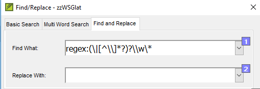
A1: Mark P says: Use the simple Find-and-Replace tool to 1st remove the second part and the \w* marker with this Regular Expression: regex:(\|
\*?)?\\w\*
And leave the Replace with box empty.
-
Then (step 2) remove the \w marker (including a space) in a second find-and-replace operation.
A2: Dan M says: Use the following RegExPal (Tools > Advanced > RegExPal) Find and Replace expression to remove all markup from your text.
Find: \\w (
Replace with: \1
Afterwards, remember in RegExPal to use Tools > Add to User Menu to save this find-replace expression so that you can use it again in future.
How to Filter Out Unreferenced Glossary Entries
In printed publications of single books of Scripture or book groups, the glossary (GLO book) may contain entries that are not relevant to that publication. The Create Glossary Filters tool in the Glossary Tools will enable you to temporarily filter out (just for a particular Print Draft or typesetting job) the glossary entries that are not referenced in that selection of books, without actually changing the GLO book.
This tool will also show you how many times each glossary terms has been tagged in the selected books. This can help you to identify glossary terms that should have been tagged but were not.
Installation: Download the contents of the Glossary Tools folder into My Paratext 8 Projects\CMS folder. Restart Paratext.
Illustrations
Translation teams are encouraged to select images during the drafting stage, as the image suitability and captions need to go through the same checking/review processes as everything else in the project. In selecting illustrations, teams should be mindful of the differing issues relating to print, Web, and app use, choosing the best illustration for each context. The team must insert the images, captions, etc. directly into the Paratext project. In the case of images for which the master is only available to typesetters, the team should instead insert placeholder images into the Paratext project.
How to tell Paratext which images are for print and which are for electronic outputs
The location sub-field of \fig is an obsolete left-over from the days of manual typesetting. PubAssist does not use it, so we have repurposed it. Longer term, there is a proposal in process for additions to the UI in the Insert Figure window with checkboxes for the various outputs, possibly storing the value in a USFM 3 word-level attribute named x-output instead of loc, but in the meanwhile, this is our current convention:
Explanation for translators: https://sites.google.com/a/lci-india.org/typesetting/home/illustrations
Further details for typesetters / app creators:
You will need to use a regular expression to filter out figures that do not belong in the output that you are creating.
E.g. In SAB, to filter out images that should not be used in an app (‘a’), use regex rules that filter out images that are only for ‘p’ or ‘w’:
Find: (?i)\\fig (
(?i)\\fig
Replace with nothing.
For the rule to use in PubAssist, see General-Purpose Rules in Changes.txt.
To change the Location field to ‘p’ for all B&W images from the SIL Samples Repository, see Reusing RegEx with the User Menu above.
How to directly insert images into a Paratext project from a searchable database
Explanation for translators: https://sites.google.com/a/lci-india.org/typesetting/home/illustrations
(Typesetters should see the section below titled General Purpose Rules in Changes.txt for rules to adjust image filenames appropriately.)
Where to Find Illustrations
SIL Image and Map Repository: Best Source for Images for Print
The SIL Image Repository contains images that are not freely available to the public, but their owners have made them available to bona fide typesetters, those whose assignments include full-time or part-time typesetting. If this describes you, then write to Steve Pillinger at [email protected], requesting the current password. (Please tell him your role in typesetting.)
While translation teams generally do not have direct access to this repository, they do have access to download or browse the SIL Sample Image Repository. These samples are low-resolution and watermarked, but serve as placeholders in the Paratext project. The collection at tiny.cc/sampleimages is an experimental version of samples that contain searchable keywords.
Placeholder images in the repository have long, descriptive filenames, while the full-resolution version in the master repository has the traditional XX00000b.tif filename. The keyword-tagged samples use only the short filename without the B or C.
For example:
Repo Sample: ShepherdLeadingSheep_BK00004.tif
Master: BK00004b.tif
Tagged Sample: BK00004.tif
See the section below titled General Purpose Rules in Changes.txt for rules to adjust image filenames appropriately.
The 2-letter code indicates the owner of the collection, which determines how the images may be used and must be attributed:
|
Code |
Type |
Artist |
Pre-auth Required? |
Print/App/Web |
Attribution (On Publication Data page except for Cook) |
|
CN |
B&W |
David C Cook (NT) |
Yes. For SIL Publications. |
Any, but needs written permission |
Imposed on each image: “© 1996 David C. Cook” Sensitive locations: “© DCC” or equivalent in local script |
|
CO |
B&W |
David C Cook (OT) |
|||
|
HK |
B&W |
Horace Knowles |
Print is OK. |
Illustrations on pages _ by Horace Knowles © The British & Foreign Bible Society, 1954, 1967, 1972, 1995. Sensitive locations: Illustrations on pages _ © BFBS, 1994. |
|
|
LB |
B&W |
Louise Bass |
Illustrations on pages by Louise Bass © The British & Foreign Bible Society, 1994. Sensitive locations: Illustrations on pages _ © BFBS, 1994. |
||
|
BK |
B&W |
Knowles revised by Bass |
Illustrations on pages by Horace Knowles revised by Louise Bass © The British & Foreign Bible Society, 1994. Sensitive locations: Illustrations on pages _ © BFBS, 1994. |
||
|
BA |
Color, Halftone |
Louise Bass |
No |
Medium not restricted |
Illustrations on pages _ used by permission of Louise Bass. |
|
DY |
Color |
Carolyn Dyk |
No |
Medium not restricted |
Illustrations by Carolyn Dyk, © 2001 Wycliffe Bible Translators, Inc. and licensed under the Creative Commons Attribution-NonCommercial- NoDerivatives 4.0 International License. |
|
GT |
B&W |
Gordon Thompson |
No |
Medium not restricted |
Illustrations on pages by Gordon Thompson © 2012 Wycliffe Bible Translators Inc. and licensed under the Creative Commons Attribution-NonCommercial-NoDerivs 3.0 Australia License. Sensitive locations: No special permissions granted? |
|
DH |
B&W |
David Healey |
No |
Medium not restricted |
Illustrations on pages by David Healey © 2012 Wycliffe Bible Translators Inc. and licensed under the Creative Commons Attribution-NonCommercial-NoDerivs 3.0 Australia License. Sensitive locations: No special permissions granted? |
|
MH |
B&W |
Michael Harrar |
No |
Medium not restricted |
Illustrations on pages by Michael Harrar © 2012 Wycliffe Bible Translators Inc. and licensed under the Creative Commons Attribution-NonCommercial-NoDerivs 3.0 Australia License. Sensitive locations: No special permissions granted? |
|
MN |
Color |
Muze Tshilombo |
Medium not restricted |
Illustrations on pages used by permission of Muze Tshilombo. |
|
|
WA |
B&W |
Graham Wade |
Print only |
Illustrations on pages _ by Graham Wade, © United Bible Societies, 1989. |
|
|
DN |
B&W |
Darwin Dunham |
Illustrations on pages _ by Darwin Dunham, © United Bible Societies, 1989. |
||
|
IB |
Color |
Faadil |
Not for use in the Middle East without written permission. |
Print only |
Illustrations by Farid Faadil. Copyright © by Biblica, Inc. Used by permission. All rights reserved worldwide. |
All needed permissions shall be obtained prior to using illustrations in Scripture publications. Write to: [email protected]. Trial print editions of 50 or less copies do not need to request permission to use illustrations.
NOTE: Illustrations from all non-SIL partners (e.g., Cook) may NOT be modified except to rotate, flip, crop or resize them.
See the SIL GPS Publishing Manual and the copyright files in the artist folders of the master repository for further details.
Use in Digital Publications
Note that for on-screen use, black and white images are generally not as engaging to the user.
-
Only for the DY, GT, DH, and MH images does the license agreement (CC BY-NC-ND) have no restriction on app/web use.
-
For Cook images (CO, CN), app and web use require advance permission, as they do for print.
-
If you wish to use the LB/HK/BK series of illustrations within Scripture Apps, then it is possible to negotiate a licence with the British and Foreign Bible Society (BFBS). However, the terms and conditions of that agreement are not straightforward, and they also expect “usage reports” at least annually. (An example agreement - that CIC was able to negotiate can be found here.) If you want to pursue this, then please contact [email protected] at BFBS.
FreeBibleImages.org: Best Source for Color Images for App/Web
Many sets of free Bible images are available at freebibleimages.org, including many from Sweet Publishing. Generally these only require proper attribution, for example, according to the terms of a CC BY-SA 3.0 license. They are suitable for publishing on web or app. As always, translation consultant approval is required prior to use, but images from sets not listed in the Approved Illustration Series of the SIL GPS Publishing Manual, that approval must be explicitly made in writing, ideally as a permanent note by the translation consultant in the Paratext project.
Maps and Labeled Diagrams
Translation teams can create a variety of maps and labelled diagrams using MapCreator. Note that this may not be ideal for creating color maps that will be printed using CMYK color separation, as small misalignments between the color plates can result in significant quality problems. For such cases, a typesetter can create maps using Illustrator and maps from the SIL Map Repository.
PERMISSION TO PUBLISH. Publications that include material disseminated by Map Creator or produced using Map Creator must include this credit:
"Some maps, charts, or drawings produced with Map Creator software from fmosoft.com. Used by permission. All rights reserved."
Publications that include material copyrighted by Crossway (drawings of Jerusalem, Tabernacle Courtyard, Temple, and Temple Mount) must also include this credit:
"Some drawings taken from the ESV Study Bible® (The Holy Bible, English Standard Version®), copyright ©2008 by Crossway, a publishing ministry of Good News Publishers. Used by permission. All rights reserved."
How to Generate the Page Numbers for Attribution
If your publication involves many images, it can be laborious to manually craft your attribution statement to fill in the blank, as in: “Illustrations on pages _ by Louise Bass © The British & Foreign Bible Society, 1994.”
Here are the steps to generate a list of page numbers:
-
In PA6, click Menu > Tools > Create figure report. This generates a spreadsheet containing a table of illustrations. It will open in Excel.
-
Sort this table by the file name in order to group the same copyright holders together. (Select the entire table. Select Data > Sort. Check “My data has headers”. In “Sort by”, choose “File name”. Click OK.)
-
For each group (e.g. all the LB pictures, which are to be attributed to Louise Bass), select the cells containing the page numbers. Copy these, and paste them into a new Notepad++ window.
-
From the Edit menu in Notepad++, select Line operations > Sort lines as integers ascending.
-
Select Search > Replace to open the Replace dialog. Find \r\n and replace with , (that is, comma space). Set the search mode to “Regular Expression”. Click Replace All.
-
Insert the word “and” before the final page number, and copy and paste the whole string of numbers into the blank in the attribution statement from the table in the section above.
Standardization of ZWJ and ZWNJ
For Indic-script texts, inconsistency in the keyboarding of zero-width characters may be the greatest barrier to making full use of PT8's Biblical terms tool, parallel passages tool, and spelling tools. The invisible zero-width joiner (ZWJ) and zero-width non-joiner (ZWNJ) formatting characters generally serve to indicate which form a consonant cluster should be displayed in: stacked, the joined half-form, or the non-joined "halanted" form.
We are developing tools to help you to standardize these characters in a Paratext project. You can download them from here. Then copy them into your Paratext’s cms folder. Re-start Paratext to find them on your menu.
Find Similar Words
Once the use of ZWJ and ZWNJ is standardized, the Find Similar Words tool can be useful. Please refer to the following documents:
-
Mark’s Find Similar Words (Using Paratext to Spell Check Indic scripts)
-
Find Similar Words for Devanagari (Goes into more detail on comparisons to use or not.)
Transferring Parallel Passage References Between Projects
Paratext has a built-in mechanism for transferring cross-references between projects (or from the standard list), but not for parallel passages.
We do have a tool for this, but it is not yet completely polished. You’ll need to make some slight adjustments to the script to provide the book names for the target. (Typically, NT parallel passages are only between these 6 books, but you can add additional lines if there are other books involved for you.)
Download the check for this from the Custom Tools (for Paratext) folder, following the installation instructions there. Restart Paratext. Go to Checking > Advanced > Unsupported > Transfer Parallel Passage References.
When running the tool, if the destination project does not contain section headings at the same verses as the source project, warning messages will be displayed in the result list. (e.g. "Warning: Section Heading did not precede parallel passage references.") Likewise, if there is no such verse found, the parallel passage references will be inserted at the top of the chapter and a warning about that will be displayed. (e.g. "Warning: MRK 7:31 not found. Parallel passage references placed at top of chapter.") In either case, double-click on the warning to check out the issue.
Converting Between Western and Script Digits
If a language prefers script digits (e.g. Devanagari) to Western digits, those digits should be used in scripture references wherever they occur. Only after \c chapter and \v verse markers should western digits be used. Otherwise, script digits should be used in following fields: \xo, \xt, \fr, \ior, \r, \sr, \rq, and also in the reference sub-field of \fig.
ReplaceDigits is a tool to convert such digits from one writing system to another. It is available here.
If a project is to be published in two versions, one with western digits and with Devanagari digits, one option is to leave western digits in the Paratext USFM files, and convert digits to Devanagari on the fly at publishing time with set of ten changes.txt rules like this (one for each digit):
in "(\\((xo)|(xt)|(fr)|(ior)|(r)|(sr)|(rq) )
WARNING: The current version of this tool only changes references. Digits in footnote text or the verse text are unaffected.
SECTION 2: TYPESETTING
Changes on-the-fly by Publishing Assistant
Publishing Assistant provides an opportunity for changes to be made to the text as it goes from Paratext to InDesign:
-
initialChanges.txt enables changes to the raw USFM data (before PubAssist does *anything* to it).
-
changes.txt enables changes to the raw USFM data.
-
finalchanges.txt enables changes to the data once it is in InDesign's own tagged format.
-
(Note that if a file named headerChanges.txt is present, it will be used in place of finalchanges.txt for headers.)
Following are rules that we've used in changes.txt and finalchanges.txt. Some of the rules are general-purpose, and should be used in any South-Asian project. Other rules are specific to issues of particular fonts. If you make a new rule in a South Asia project, please add that rule here, so that other projects can also incorporate it.
Here is a link to Randy’s RegEx Cheat Sheet v12 for Paratext (in PDF format).
Rules in initialChanges.txt
# Make space before last word in a section heading a non-breaking space
"(\\s( \S+)+) (\S+\s*\n)" > "\1\u00A0\3"
- And also do the same for \q1 and \q2 so that poetry doesn’t have orphaned words
"(\\q1( \S+)+) (\S+\s*\n)" > "\1\u00A0\3"
"(\\q2( \S+)+) (\S+\s*\n)" > "\1\u00A0\3"
# Note that you could do this anywhere if need be!
General-Purpose Rules in Changes.txt
# FILTER OUT FIGURES
# Hide figures that are tagged in the loc field only for app (a) or web (w), not print (p).
'(?i)\\fig (
'(?i)\\fig
# Drop the references for the Figure Captions (no longer needed if done in captionChanges)
# in "\\fig .*?\\fig\*": "\d+\:\d+(\-\d+)?" > ""
# In your CaptionChanges.txt you could just have this: " (\d+\:\d+(\-\d+)?)" > ""
#==============
# ADJUST PLACEHOLDER IMAGE FILENAME TO MATCH MASTER FILENAME
# for images in the SIL Image Repository
# 1. Remove descriptive portion from placeholder filenames like JesusWithChildren_CN01600.jpg,
# if user has employed that version of the samples.
in '\\fig
# 2. Set resolution to "B" (Best quality) for images that need B or C after digits. e.g. CN01600b.jpg
in '\\fig
# 3. For JPG samples of repository images, set format to TIF.
in '\\fig
#=============
# Insert thin space + colon after key term (needed in GLO).
'(\\k\*)' > '\1\u2009:'
Add space before certain punctuation
In some scripts (such as DEV, ORI etc.) some punctuation characters cause problems as there isn't enough space before them. An example is the Devanagari Danda, which is often gets mis-interpreted as the long-A matra. In order to add more space before them, use the following rule to insert a thin space.
# Insert thin space before punctuation
'(।॥?’”)' > '\u2009\1'
Not-so-General-Purpose Rules in Changes.txt
# Add a colon after quoted text, before the \ft or \xt begins. This rule
# will put a colon in whether it is there or not in the text itself!
"(\\fxq .+?):* (\\fxt)" > "\1: \2"
# Find a verse? digit and space followed by any Telugu single syllable word which is followed by a space,
# and replace the final space with a non-breaking space so that it will always be attached to the next word
# and prevent this orphan word from coming at the end of lines
'(\d \u0C05-\u0C39\u0C3E-\u0C4D?) ' > '\1\u00A0'
# Ensure re-duplicated words stay together (with a NBSP between them)
# e.g. “duga duga” is a concept that should never be separated by a line break
# or “baga baga” which means wherever, rather than “where where”
"(?<=)(\S\S\S+)-*\1(?=\s,.!?)" > "\1\u00A0\1"
#
General-Purpose Rules in FinalChanges.txt
# Insert tab at start of ior field, so references in book outline can line up nicely.
'
Rules to Replace Arial Unicode's Ugly Punctuation
First, in Changes.txt, add the following rules:
# AVOID ARIAL UNICODE PUNCTUATION
# If you are using Arial Unicode (which has ugly punctuation characters) use these rules AND ALSO the
# corresponding rules in finalchanges.txt to format all punctuation characters with an alternative font:
# This rule marks all true punctuation characters, so that characters within
"(\.\,\!\-\:\;\“\”\'\"\‘\’\?\u2011+)" > "\u300A\1\u300B"
# Remove marks from \fig fields (not just from dot in filename, but even from caption and reference),
# as these may crash PA:
in "\\fig\s+.*?\\fig\*": "\u300A\u300B" > ""
# Remove marks from \fr and \xo fields, as they don't need to use Arial Unicode:
in "\\((fr)|(xo))\s+
Then, in FinalChanges.txt, add the following rules:
# AVOID ARIAL UNICODE PUNCTUATION
# If you are using Arial Unicode (which has ugly punctuation characters) use these rules AND ALSO the
# corresponding rule in changes.txt to format all punctuation characters with an alternative font:
"\u300A" > "
"\u300B" > "
Rule to Mark Glossary Items with ⌊Floor Characters⌋
If glossary items are marked in a print publication, they might be marked by using bold face, by inserting a special caller like ❖ before or after the term, or by inserting floor characters, like this:

To replace the \w marking with floor characters, add this rule to Changes.txt:
# Replace \w markers with ⌊floor characters⌋
"\\w (
Or to use ⌞corner characters⌟ instead, use this rule: (Generally they are shorter, but possibly with more horizontal gap)
# Replace \w markers with ⌞corner characters⌟
"\\w (\\*)(\|
Then, see the next section for formatting…
Rule to apply special formatting to ⌊Floor Characters⌋
Whether a project uses floor characters to mark glossary items or to mark other kinds of text (e.g. implicit information translated explicitly), these will seldom look exactly right. A font might not include them, or if it does, they may stand out too much.
A FinalChanges.txt rule will allow you to get the floor characters to look just right. First experiment on a sample floor character in InDesign, adjusting the settings for font, size, and baseline shift to make it look exactly the way you want it to. Then select that text, and choose File > Export > Save as Type: Adobe InDesign Tagged Text > Abbreviated. At the bottom of the exported file you'll find the tags you need in your rule. Adjust the sample rule below accordingly as you insert it into FinalChanges.txt.
For example, for 6 pt Charis SIL with 0.5 pt shift and no break:
# Apply formatting to ⌊floor characters⌋
'(\u230a\u230b)' > '
Font-Specific Adjustments (in FinalChanges.txt)
GUJ Patel
# Compensate for problem in GUJ Patel to position anusvara after Ja+E_Matra
'જેં' > "જે
Arial Unicode with GUJ
# Compensate for Arial Unicode bug in GUJ that double-draws anusvara after i-matra. e.g. નિં
"\u0ABF\u0A82" > "\u0ABF
# Compensate for InDesign rendering of GUJ nukta in Arial Unicode that mispositions nukta instead of using font's glyph
'(અઆઍઑઓ\u0ABC)' > '
Arial Unicode with DEV
# Compensate for Arial Unicode bug in DEV that double-draws anusvara after i-matra. e.g. निं
"\u093F\u0902" > "\u093F
# Compensate for InDesign rendering of dev nukta in Arial Unicode that mispositions nukta instead of using font's glyph
'(अआइईउऎऒओ\u093C)' > '
Adjustment for a project that puts note callers at the start of text, not after.
This rule will move the noteCallerSpace to come before the note caller:
# This project puts note callers at start of text, so move noteCallerSpace BEFORE Note caller
'(
Adjustments for texts being submitted to the DBL (in DBLchanges.txt)
Here’s another handy trick if something needs to be tweaked for the DBL text…
'\u00AB' > '\u2018' # use single open curly quotes for unspoken words «
'\u00BB' > '\u2019' # use single close curly quotes for unspoken words »
# Add a colon after quoted text, before the \ft begins, or \xt begins.
"(\\fxq .+?):* (\\fxt)" > "\1: \2"
Page Numbers in the Running Header in Two Different Scripts
Suppose you want to have page numbers shown in both Devanagari and Western digits, like this:

Here the Devanagari digits are at the outer side, and the Western digits are at the inner side.
In PA, configure Headers/Footers to put the page number on both the inside and the outside, for both left and right page heads. Set the page number script to Devanagari:
From the Edit menu, select Edit HeaderChanges.txt.
Add this content to that file, and save it:
# Apply pgNumInner style to inner page number (assuming there are two page numbers)
'(
'(
# Convert DEV digits to western
in '
in '
in '
in '
in '
in '
in '
in '
in '
in '
The first section (in green) applies a new character style named pgNumInner to the digits that are on the inner side.
The second section (in yellow) replaces digits within that style with the corresponding Western digits.
Generate the InDesign document, but before adjusting any pages, create a new character style named pgNumInner. Set appropriate formatting for Western digits, such as the Charis SIL font.
Adjust the page. If necessary, adjust the pgNumInner style to obtain the look that you need. Remember to synchronize this style across any other documents in the book, and/or to update your stylesheet to include it, for any future documents you generate.
Note: Once you’ve created HeaderChanges.txt and done an adjust operation, in the import folder under your typesetting job folder, you will see these two files:
Header.HeaderChanges.Input.txt
Header.HeaderChanges.Output.txt
These show what the HeaderChanges.txt rules received, and what they produced. You can make adjustments accordingly.
Best Practices for Page Headers
Reference Format
One excellent option is to put the reference in the center of the header, with the page number at the outer edge. (Optionally, the inner header may then have the page number in a secondary script.) This has the advantage of the reference looking balanced, and serving as a sort of title for the page. In this case, it’s good if it specifies the range contained on the page, ideally by chapter (Mark 7-8), though it is also possible to display the entire reference (Mark 7:31—8:14).
This is another case where just because you can easily do something, it doesn’t mean that you should. We used to include the entire range with verse numbers (e.g Mark 7:31—8:14) in headers, but further study revealed that it is more helpful to the readers when flicking through looking for a text to have just the chapter range (Mark 7-8) - otherwise there is simply too much information to take in, and you have to pause at each page to read and absorb the whole reference. So in this case, more is less, and less is more!
English References in the Inner Header?
It’s debatable whether English references in the inner side of the header are a good thing. One one hand, this may add an unnecessary Western flavor to the publication, as if Christianity were a Western religion and the Bible a Western book. (Generally, for a book to feel like authentically vernacular publication, the only page where English is seen should be the Publication Data page.) On the other hand, if speakers of this language find learning the English book names attractive, that may justify putting English in the headers.
If putting English references in the header is the right choice for a particular publication, here are two methods to do so:
Method 1: With English books names in \h1 field in Paratext files.
The project must have two header fields, one in the vernacular language, and one in English, like this:
|
\h याकूब \h1 James |
First, add the following to Changes.txt:
#=============
# When the USFM files already contain English Book Names in \h1 field, these rules will
# them accessible (In PA headers settings, access these with a '.h' code, e.g.
#=============
'\\h .*?\r?\n' > # Delete any existing \h field.
'\\h1 ' > '\\h ' # Promote \h1 field to \h field.
Then see the final step (below Method 2).
Method 2: Without English books names in \h1 field in Paratext files
It is not necessary to insert English names into the Paratext project. (The typesetter might not have edit permissions, or the translator’s English spelling may be error-prone.) Instead, add the following to Changes.txt:
#=============
# To access English Book Names in header when the USFM files do NOT contain them in \h1 field.
# (In PA headers settings, access these with a '.h' code, e.g.
#=============
'\\h .*?\r?\n' > # Delete any existing \h field.
'\\id MAT.*?\r?\n' > '\0\\h Matthew' # Insert an \h field containing the English book name:
'\\id MRK.*?\r?\n' > '\0\\h Mark'
'\\id LUK.*?\r?\n' > '\0\\h Luke'
'\\id JHN.*?\r?\n' > '\0\\h John'
'\\id ACT.*?\r?\n' > '\0\\h Act'
'\\id ROM.*?\r?\n' > '\0\\h Romans'
'\\id 1CO.*?\r?\n' > '\0\\h 1 Corinthians'
'\\id 2CO.*?\r?\n' > '\0\\h 2 Corinithians'
'\\id GAL.*?\r?\n' > '\0\\h Galatians'
'\\id EPH.*?\r?\n' > '\0\\h Ephesians'
'\\id PHP.*?\r?\n' > '\0\\h Philippians'
'\\id COL.*?\r?\n' > '\0\\h Colossians'
'\\id 1TH.*?\r?\n' > '\0\\h 1 Thesalonians'
'\\id 2TH.*?\r?\n' > '\0\\h 2 Thesalonians'
'\\id 1TI.*?\r?\n' > '\0\\h 1 Timothy'
'\\id 2TI.*?\r?\n' > '\0\\h 2 Timothy'
'\\id TIT.*?\r?\n' > '\0\\h Titus'
'\\id PHP.*?\r?\n' > '\0\\h Philemon'
'\\id HEB.*?\r?\n' > '\0\\h Hebrews'
'\\id JAS.*?\r?\n' > '\0\\h James'
'\\id 1PE.*?\r?\n' > '\0\\h 1 Peter'
'\\id 2PE.*?\r?\n' > '\0\\h 2 Peter'
'\\id 1JN.*?\r?\n' > '\0\\h 1 John'
'\\id 2JN.*?\r?\n' > '\0\\h 2 John'
'\\id 3JN.*?\r?\n' > '\0\\h 3 John'
'\\id JUD.*?\r?\n' > '\0\\h Jude'
'\\id REV.*?\r?\n' > '\0\\h Revelation'
#================
Final step: PA job settings
After one of the above two methods, in the PA job settings, use a .h code to get the book name from the changed \h field, like this:
Making Changes to Page Headers After Typesetting
See this article: How can I change the headers in a job after the typesetting is complete?
Best Practices for Footnote and Cross Reference Callers
In order to minimize the mental hurdles that a reader must go through to find a footnote or cross-reference, it can be useful to use sequences of symbols. These are configured in Paratext, under Project > Language Settings > Other Characters.
In Indic-script publications, it’s best to avoid using “a, b, c, d”, as these give it a Western flavor, and may be difficult for newly-literate minority-language speakers to distinguish.
It’s also problematic to use “क, ख, ग, घ” sequences, because for new readers it's too tempting to try to read that as part of the word.
One option for a sequence used for footnotes is “✶ ☆ ✦ ✪”, typeset in Arial Unicode MS. The first symbol looks very much like the familiar asterisk, but is sized to match the rest of the symbols.
One option for a sequence use for cross references is “† ‡ § ¶ # Δ ◊”. (This follows the traditional sequence, but we don’t have to be constrained by that.) These symbols are ugly in Arial Unicode MS, however, so a font like Charis SIL makes a better choice.
I’d recommend restarting the sequence on every page. (On PA6’s Footnotes tab, “Override __ Caller Sequence”.)
In InDesign, you’ll want to adjust the font name, font size, and baseline shift for the CrossReference Caller, CrossReferenceCallee, noteCaller, and footnoteCallee character styles.
Best Practices for Setting up Notes
BSI has recently been requesting that the length of the note frame rule (the horizontal line between notes and the text) vary according to the length of the content. This is needlessly laborious. They will accept all notes having the same full-width rule.
Best Practices for Determining Line Spacing
You should use the Alignment Helper to fine-tune your line spacing (or “leading”), but before you can do that, you may need to experiment with the verse text in the chosen point size of the chosen font to determine the minimum line spacing. This setting may be different for different languages using the same font if one language uses taller character combinations than another. Find the leading that ensures the descenders of one line will never get confused with the ascenders of the line below it. Let that be your initial Line Spacing setting (on the Basics tab).
Best Practices for Section Headings and Parallel Passage References
Use a quickly-generated draft (without column balancing) to help the translation team recognize unduly long section headings and parallel passage references. Tell them something like this:
If parallel passage references
wrap onto two lines, please consider simplifying the level of detail. e.g. Simply the reference where the parallel starts, or the start and end of the parallel without going into detail . e.g. Instead of saying "John 18:13,14,19-24", simply say "John 18:13-24".

The reader can easily discover for himself which specific verses there are parallel. This is a case where "less is more", because simplicity makes things easier for the reader. It will also make for better typesetting, as large keep-together blocks can result in text getting over-stretched or over-shrunk.
Similarly, if you see any section headings that wrap onto two lines that could be expressed in one line, that will help, too. e.g. "Vine and Branches" works better than "Jesus talks with his disciples about the vine and the branches". Of course, if it cannot be shortened, you may be stuck with a long section heading.
Eliminating Space Above Section Headings at the Top of a Column
When Automatic Vertical Justification is set to “No” (as it should be for the best-quality typesetting job with front-to-back registration of verse text), whenever a section heading appears at the top of a column, there will be whitespace above it, almost an entire wasted line.
For example, with 10 pt leading, the section heading will be padded with 8 pt Space Before (80% of leading) and 2 pt Space After (20% of leading):

When the section heading is not at the top of the column, this works out nicely, as seen in the left column above. However, when the section heading comes at the top of the column, almost a full line is wasted, as seen in the right column above.
When section headings come at the top of the column, a better approach is to raise them one full line higher, like this:

Only if you look very closely will you be able to notice that the top of the section heading is slightly higher than the top of the text. The only change that is very noticeable is that the ugly blank line is gone.
To achieve this, the settings for the section heading paragraph style must be adjusted like this:
-
On PA’s Headings tab,for Section Headings, the Line Spacing and Space Before settings should both be set to the same value as the main Line Spacing setting from the Basics tab.
-
In InDesign, edit the “s” paragraph style. On the Advanced Character Formats tab, set the Baseline Shift to the number that is 20% of the main Line Spacing (Leading) value. (Remember to save these styles into the stylesheet for future use.)
-
Also edit the “r” character style and enter the same amount of Baseline Shift for that, so that it “moves” up along with the section heading.
Special Handling for Parallel Passage References that Span Two Lines
Ideally, parallel passage references should fit on one line. But sometimes, overzealous translators feel they must go into nitty-gritty details of exactly which verses in a range are parallel. Or they don’t like to abbreviate book names. Whatever the cause, when this happens, the first thing you should try to do is select that line of text and shrink it, if possible.
If, however, you are unavoidably left with two lines of parallel passage references, because the text is smaller, the lines may look too far apart, like the example on the left:
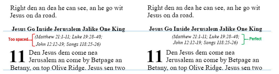
One solution is to bring the second line of parallel passage references a little higher, as shown in the example on the right,
leaving everything else exactly where it had been on the page, so that line-to-line registration is not affected.
First create a new character style named “r-line-2” based on the “r” character style, but set its Baseline Shift to be about a couple points more than the baseline shift of the underlying “s” paragraph style. (See previous topic.) Experiment to get exactly the spacing you prefer.
Then, when you encounter parallel passage references that cannot be squeezed onto a single line, simply select the text on the second line and apply the r-line-2 character style.
Color Management
A PDF to be published by BSI should call only for black ink. Even though a PDF may appear to contain only black, it may contain “rich black”, which is black ink plus the 3 color inks. CMYK has four layers of ink: Cyan (C), Magenta (M), Yellow (Y), and Black (K). You need to ensure that the C, M, and Y layers in your PDF are completely empty.
How can I tell in Adobe Acrobat whether the CMY layers of a PDF are empty?
-
Select View > Tools > Print Production > Output Preview, and uncheck Process Black. If all the pages are not completely white, this PDF is calling for other inks, and will not be acceptable to BSI.
How can I check in InDesign if the PDF I am about to export will contain color inks?
-
In the book panel, select all documents.
-
From the book panel’s dropdown menu, select “Package selected documents for print”.
-
A Package dialog box will pop up with the Summary information. If you had used color inks on the images or elsewhere, the summary will prompt you that there is a use of RGB color space, and it will show that the number of process inks is more than one. The only ink should be “process black”.
What do I do with B&W TIF images so that they will not contain color information?
Apparently depending on version, settings, and possibly PDF creation method in InDesign I haven’t been able to figure out which!, black-and-white TIF images may be represented as “rich black” in your PDF, meaning that your PDF will inappropriately contain color inks.
If you cannot find another way to eliminate the CMY layers, one workaround is to ensure that the image files that the InDesign document links to are actually JPG images saved “as grayscale”. For this, you must first convert your TIF files from the SIL Master Repository. Here’s one way to do this:
-
Download and assemble in one folder the TIF files from each of the B&W folders in the master repository (Cook, Dunham, Knowles & Bass, Gordon’s Graphics, and Wade), selecting the 600dpi sub-folder where applicable.
-
Download the IrfanView application.
-
From the File Menu, click Batch Conversion/ Rename..
-
On the right corner, click Look In and choose the input folder, where you have placed the TIF files. Select All and click the Add button to add your input files for conversion.
-
Choose the Output format as JPG - JPG/ JPEG Format.
-
Click the Options button and check the Save as grayscale JPG, checkbox. You can increase the quality of the output file to say 95%. Click OK.
-
Choose the Output directory to store the Result files.
-
Click the button “Start Batch” to convert all the TIF files to JPG.
-
You can now check your output folder to verify the JPG images.
-
In PubAssist, under Tools > Options > Optional Figures Folder, browse to specify this JPG folder rather than the TIF folder.
Using the Alignment Helper
These settings used to be calculated in a spreadsheet, but having this helper built into PA6 makes things so much easier.
These settings can look intimidating at first, because it's showing you everything that needed to appear in the spreadsheet. However, once you learn what to focus on (and what to ignore), this tool lets you produce better results.
Note: Proposals to simplify this interface are being discussed here.
Calculate Top Margin
This tab looks like this:

Note that the 2nd and 4th fields are settings from other tabs. Any changes to them made here are immediately copied back to the corresponding tab. By changing them here you can see how they contribute to the total top margin calculation. You can also select which units you’d like to see the calculation in.
What it’s all about:
The publisher may require a certain amount of gap between the top edge of the page and the top of the text. (The distance shown below with a red arrow.) They may refer to this gap as the “top margin”, but PA uses the term “top margin” to refer to the distance from the top edge of the page to the top of the “pink box” that the text fits within. PA’s Top Margin must include space for the measurements of all three arrows in the image below:

Red arrow:
The space required between the top of the page and the top of the header. Enter this distance in the first field.
E.g. 10 mm
Orange Arrow:
Next you’ll need to enter the distance from the top of the header text to its baseline. (This is called the “Effective Header Height”.) For a writing system that has occasional top diacritics (as in the image above), I’d define the top as about halfway up those diacritics, as not all book names will have them. Ideally, you should measure this distance in your document to be accurate. But as a general rule of thumb, for most writing systems and fonts, this is typically about 70% of the header font size. Another way of saying “70% of the header font size” is 0.7 em.
Note: Prior to PA 6.0.100.17, the default value was based on the metrics of the font, but this was problematic. The current default is 0.7 em. If you’re using one of the commonly-used fonts listed below, you can ensure an accurate distance by using the corresponding em value:
|
Font |
Effective Header Height |
|
Arial Unicode MS |
0.72 em |
|
Annapurna SIL |
0.75 em |
|
Rachana |
0.68 em |
|
TAML ThiruValluvar |
0.68 em |
|
Charis SIL |
0.68 em |
|
A_Reethi |
0.75 em |
|
Noto Serif Bengali |
0.77 em |
|
SolaimanLipi06 |
0.68 em |
|
Hajong Assamese |
0.75 em |
|
Minion Pro |
0.65 em |
|
Gentium Plus |
0.62 em |
Otherwise, accept the default of 0.7 em, and measure the result in InDesign. Then you can adjust the top margin accordingly, if necessary.
Green Arrow:
This distance is the “Space between Heading and Text” setting from the Headers/Footers tab. PA automatically enters this for you.
By adding these three distances together, the tool will propose a Top Margin setting. Click Apply to set it.
Alignment Settings Helper (Fine-tuning your Leading)
This tab looks like this:

As with the Top Margin tab, most of the inputs come directly from other tabs. The Font Size, Leading, Page Height, Top Margin, and Bottom Margin come from the Basics tab. If they are edited here, their values are copied back to the Basics tab.
Once you’ve finalized your page height and top and bottom margin settings, these define the height of the body frame, that is, the “pink box”. Your goal is to make the best use of the vertical space available in the pink box.
It’s recommended that you reserve some space at the bottom of the pink box for “descender padding”. Print on demand requires that no ink appears below the bottom of the pink box, so setting the Descender Padding to 0.3 em will generally reserve an appropriate amount of space.
When the remaining height in the pink box is divided by your chosen line spacing (See Best Practices for Determining Line Spacing above), there will almost always be a fraction of a line left over. If it’s almost a whole line, you might consider squeezing your leading just a tiny bit so that you’ll get an extra line of text on the page. If that would be too tight of spacing, rather than throwing this remainder away at the top or bottom margin, it is better to divide it across all the lines to improve readability. Either way, you’ll get the baseline of the bottom line of text to be perfectly positioned at “descender padding” height above the bottom pink line, making the best possible use of the available space.
Look at the recommendations, particularly (a) and (b). If the reduced leading of (b) is not too far from your current leading, try it and see whether it’s acceptable. If that’s too tight, choose option (a) to distribute the extra space across all lines. Click Apply on your chosen option to update your Line Spacing setting.
Finally, look at the “Footnote Recommendations” section. What percentage of the verse text size should the footnote text be? Enter this as the Desired Percentage. It’s best if this is a figure that corresponds to a common ratio of whole numbers, such 75%, 80%, or 66.6666%. For example, at 75%, four footnote lines occupy exactly three page lines. Since you’ve just changed your leading, click Apply here to update your footnote settings accordingly.
Note: As of PA 6.0.100.17, the calculation for the note frame rule leading box shows you the value that PA6 will use if you leave the Note Frame Rule Leading setting empty on the Footnotes page. If you want the Note Frame Rule to occupy at least one full line of the main leading, then this value is fine. If you are not using vertical justification, this value will result in a gap between text and notes that is greater than or equal to one line, and less than two, depending on the number of lines of footnote text and the footnote leading. To have the note frame rule create a minimum gap of a certain number of lines, such as 0.8 lines, then multiply that factor by the number shown here, replacing this number with the product. For example, if the main leading is 12 pt, this number will initially be 8 pt. If you want the minimum gap to be 0.8 lines, replace 8 pt with 6.4 pt (8 × 0.8) and click Apply. If you later adjust the leading, then come and recalculate this setting, too.
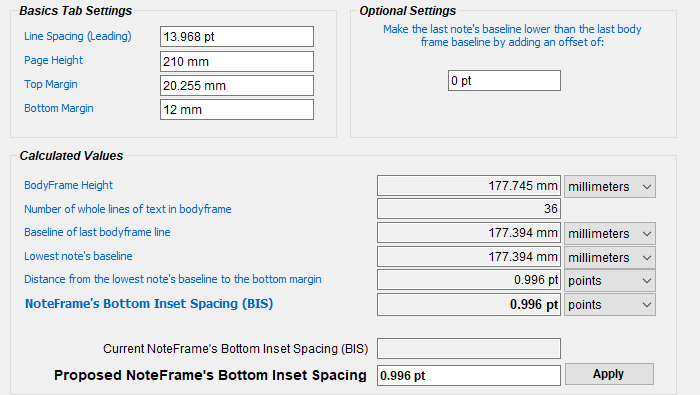
Calculate NoteFrame’s Bottom Inset Spacing
With some versions of InDesign, it used to be necessary to use this tab to calculate the “Noteframe’s Bottom Inset Spacing (BIS)”, an internal setting that enabled the baseline of the last note to align with the baseline of the verse text, like this:

Note: If you’ve used the Alignment Settings Helper, this distance will normally be the same as that produced by the “Descender Padding” setting.
However, PA6 now correctly calculates and applies the correct BIS in all versions of InDesign if it is set to zero, which is its default setting.
Now that that works, the only reason to use this page is if for some rare reason you want the last note’s baseline to be offset from the baseline grid. For this, supply a non-zero value for the “optional setting”, and click Apply.
Note: If what you actually need is to move all text (whether verse or note) up from the bottom of the main text frame (the “pink box”), simply use the “Descender Padding” setting on the Alignment Settings Helper tab, rather than adding an offset here.
Stylesheets (Templates for PA6)
Please help us assemble an assortment of PA6 stylesheets in the Indic Typesetting Google Drive. Be sure to use the Description property to provide more details about stylesheets that you upload.
Tips for Adjusting Pages
Section Headings
When typesetting section headings that occupy two lines (and are too long to shrink to one line), manually break the line by pressing SHIFT+ENTER to provide better balance between the two:
Footnotes/Cross References
-
PA sometimes places a footnote that has just one word wrap to the next line. Shrink that paragraph and resize the notes frame for a better look.
-
PA sometimes struggles to make a note fit when the caller comes near the end of the text on the page before the note text has been placed. If you see PA struggling, and possibly exerting more shrink/stretch than is optimal, backing up a page or so and applying a small amount of shrink/stretch there can solve the problem on the current page. Also note that after PA has struggled to fit such a note, it may leave shrink/stretch applied to the final paragraph, even though it may make no difference at all in whether the caller on on the desired page. You may be able to remove the adjustment from that entire paragraph, or at least from the part of the paragraph that is on the next page.
Avoiding automatic column balancing
For the best quality results, avoid using automatic column balancing and Adjust All. These are geared for finding an OK solution. However, it might shrink something extremely tight when a very slight expansion would have solved the problem and produced better-looking text. For the very best results, adjust the page without automatic column balancing. If a column is not balanced, peek at the next column to see how many lines are in the next keep-together block, and compare that to the number of blank lines to be filled. Make your shrink/expand paragraph/column/page choices accordingly.
Using End-of-Ayah bubbles instead of verse numbers
For publications with a M’lm audience, you may want to consider using end-of-ayah bubbles instead of verse numbers. This will require special finalchanges rules.
For Bengali script projects, the Maulana Azad font has Bengali digits inside the end-of-ayah.
Converting Text to Outlines
The safest way to send a PDF to a printer who may mess up the font information is to instead send a PDF that contains outlines instead of text. Instructions for doing so can be found here.
Recommended Fonts
Deva: Annapurna SIL
Various Indic: https://github.com/nlci
GREP Style rule to look for missing punctuation:\-\\“–”—
North Indian languages
-
Hindi/ Devanagari - Annapurna SIL (many Indian languages are covered) (Arial unicode also works, but this is better)
-
Oriya - Kalinga
-
Bengali - SolaimanLipi06
-
Assamese - Hajong Assamese
-
Gujarati - Patel Guj (Arial unicode also works)
-
Nepali - Annapurna SIL Nepali
South Indian languages
-
Malayalam - Rachana
-
Tamil - TAML Thiruvalluvar (now we have 3 font flavours of the same - Irula, JK and standard), Latha
-
Kannada - Tunga
-
Telugu - Suranna UI/ Suranna
How to Set up a Diglot to Minimize Whitespace due to Line Alignment
You can't completely eliminate whitespace, but you can make it so that the whitespace is rare, and is not disproportionately in one language more than the other.
-
First, work with the translation team and publisher to determine the ideal font size for each language. Typically the reference text (in this case Hindi) is done a bit smaller.
-
Next, for each language, determine the best leading for its font size. (It's possible for this to vary from one language to another if one language uses some character combinations that require extra height/depth, such as nuka under u-matra.) Use the alignment helper to fine-tune the leading so that if you're close to getting another line of the page, you'll get that.
-
Next, the goal is to find the percentage of the page width to give to each text so that, on average, they will come out to the same length.
-
Start by creating a diglot book with equal column widths, and flowing the text for the whole book without doing any adjustment work.
-
Calculate the percentage of the total content that comes from each language. Suppose you find that Hindi occupies 27.5 columns, while Kinnauri occupies 35 columns. Add these together to get the total: 62.5. This means that Hindi has 27.5 / 62.5 = 44% of the total column length, while Kinnauri has 35/62.5 = 56% of the total column length.
-
In PubAssist settings, give each language its percentage of the available page width, and create the book again, without doing any adjusting.
-
Check if they come out about the same length. If not, make fine-tuning adjustments to the percentages until they come out close to the same length.
-
How to Typeset a Study Bible Additions Project
Actually, you cannot typeset a Bible Study Additions (SBA) project directly from PA. Here's what a translation team with an SBA project needs to do so that you can typeset the project:
Initial Setup:
-
Create a new project of type "Study Bible" (SB), based on the same scripture-text project as your Bible Study Additions (SBA) project is based. Register it online so it will be accessible to PA and eligible for Send/Receive.
-
UNCHECK Project Settings > Advanced > Editing Enabled. (The only changes to this project will be auto-generated by the merge process.)
-
Under User Permissions, set up the project for Send/Receive, and add your typesetter as a consultant.
Usage:
-
After adding/modifying Study Bible content in the SBA project, be sure to click SAVE in that project.
-
In the SB project, go to Project Settings, where you'll see a tab found only on SB projects: Additions.
-
In the Additions tab, add your SBA project as the additions project.
-
Click the Check Connections button. If any errors are listed in the List window, see the Help topic "What do I do with disconnected items in a Study Bible Additions project?"
-
Click the Merge button. The current contents of the SB project will be overwritten by the contents of the base project and of the SBA project.
-
Do Send/Receive on the SB project.
-
Inform the typesetters that the SB project is ready for them.
-
WARNING: Note that currently only scripture books get merged. Books like FRT, BAK, and GLO would need to be manually copied to the SB project each time a change is made. (Temporarily re-enable editing for the project when you do so.)
Old Content to Be Updated
Typical Steps in Generating a New Stylesheet
If you need to create a new stylesheet, here are the typical adjustments that will need to be made.
STEP 1. Start with a stylesheet/template of "None", so that the subtle parameters of a stylesheet designed for a different font or different point-size or leading will not mess things up.
STEP 2. The very first settings that must be worked out are the Font's Point Size and the Leading. Until you have finalized these, don't waste too much time configuring document styles, as you'll have to start fresh (without basing on Current.txt or any other template) when you fine-tune these settings, as the main Leading setting affects multiple styles. You will fine-tune the leading setting in STEP 4.
The "right point size" is a matter of negotiation between the translator (who typically wants it bigger, for the new readers) and the publisher (who typically wants it smaller, to reduce costs). Any point size number is completely meaningless on its own (without specifying a particular font), as 14 pt characters in one font may have the same size (x-height) as 10 pt characters in another font. Note, too, that some fonts may have relatively thin line thickness. You may need to add a tiny bit of stroke (for boldness) to certain fonts, such as Arial Unicode when used for Gujarati. (In this case, add it to the default paragraph style.) In this way, you may be able to stay with a lower font size while still obtaining something that is not "too thin".
Smaller font sizes make for easier typesetting. If it gets too big, you'll have to go with a single-column format.
If the language uses character combinations that stack unusually low (e.g. nukta coming under u-matra), you may need to increase the leading so that there is no overlap or confusion between an upper line's descenders and the lower line's ascenders. If there are no stacking characters or nukta, you may be able to use a decreased leading.
Print out a sample, so that the translator can see in hard-copy how it will look.
STEP 3. Once the point size and leading are decided upon, adjust all other settings in Publishing Assistant (PA) accordingly:
-
Generally BSI would like the Running Header Font Size to be the same as the main text Font Size.
-
Also, BSI would like the Space between header and text setting to be the same as (or very close to) the Leading setting.
-
The Section Heading Font Size (\s, or PA's "Headings" tab), should not be larger than the main text Font Size. (The bigger it is, the more likely a section header will wrap onto a second line, making for a larger keep-together block that must be handled.) If you can get permission to reduce it slightly, it can make for easier column-balancing.
-
The References Font Size should normally be 75% of the size of normal text.
-
The Font Size for Notes and Leading for Notes settings must be set at this stage. Normally these are 75% of the main font size and leading. If those are fine-tuned, adjust these at the same time.
-
The Page Bottom Margin: Traditionally BSI has required 12 mm of gap between the bottom edge of the page and the text. Since descenders from the text may jut into this space, depending on the script and font size, you may want to add another 1-2 mm to the Bottom Margin setting. E.g. 13.5 mm
-
The Page Top Margin setting is the distance from the top of the page to the top of the text body frame. Use the Calculate Top Margin page of the Alignment Helper to configure this setting.
-
For non-Roman projects, ensure that you are using the World-Ready Composer and that Optical Margin Alignment is turned off.
STEP 4. Baseline Alignment
On a page with footnotes, you will notice that the baseline of the bottom line of footnotes may not be aligned with the baseline grid. PA4 assigns a seemingly arbitrary amount of inset padding to the bottom of the footnote frame. (Actually, the value depends on the footnote leading and certain metrics of the footnote font, but it is not a generally useful amount on Indic fonts.) We expect this problem to be corrected in PA4.1, but in the meanwhile, you need to be able to get the verse text's baseline grid to be aligned with that of the bottom line of footnotes. For help with the necessary calculations, use the Alignment Settings spreadsheet. Update: Use the Alignment Settings Helper to fine-tune the main and footnote leading.
STEP 5. Adjust Styles that will be Exported to the Current.txt Template.
One of the first styles to adjust is the note frame rule paragraph style:
-
Under Justification | Rule Below, set the left indent to zero and the right indent to 140 pt. (That's just how BSI likes it.)
-
Reduce the leading to less than one point, and increase the space after by that exact same amount that you've subtracted from the leading. This will bring the rule closer to the footnote, while keeping the footnote as low as possible on the page.
It's important that Footnote references (char style fr) are visually distinct (different font/face/style) from footnote text. For example:

Verse numbers:
-
v (char) : Adjust point size so that numbers will be 75% of the size of corresponding characters in the verse text; Adjust BaselineShift so that tops of verse number is the same as the top of typical vowel flags.
-
v1 (char): Adjust point size to be same size as corresponding characters in the verse text; Adjust BaselineShift to zero.
-
vsp (char) : Increase HorizontalScale (perhaps 200% or even 400%)
-
v1sp (char) : Increase HorizontalScale (perhaps even as high as 800%)
Note that it is possible to add stroke to either a paragraph or character style using the setting found on style's Character Color tab, by clicking the "stroke settings" square which may initially be partially overlapped by the "fill settings" square:
It may be necessary to fake an italic face by adding about 15° of skew to the caption paragraph style, and to the r, fq, qt and fk character styles (if present).
It may be advisable to reduce the size of the caption paragraph style a little, for added visual distinction from the text.
Sometimes there is a request to slightly indent the left and right sides of section headings (s paragraph style). This helps to make the section headings visually distinct, but it can also cause a section heading to wrap onto a second line, making for a larger keep-together block.
The io1 paragraph style can have a right-aligned tab-stop added with a dot (.) for the leader, so that ior fields line up nicely. (Use the appropriate finalchanges.txt rule to generate tab characters.) The io1 paragraph style may also do well to be reduced somewhat in point size and leading.
Once all styles have been adjusted, export them to Current.txt, test that it generates everything properly, and then build a PA stylesheet from the combination of your PA settings and these styles.